A UX Case Study — Redesign a Non-Profit Website (Part 1)
Toolkit - Pen, Paper, Business Model Canvas, Lean Survey Canvas, Google Forms, Value Proposition Canvas, Miro
UX Techniques - Business Analysis, Survey, Desk Research, Proto-persona, User Stories, Information Architecture, Interaction Design, Interface Design, Interface Design, Navigation Design, Information Design, Sensory Design, Solutions
Overview of the Non-Profit Organisation
Caregivers Alliance Limited is a non-profit organisation and was incorporated on 25 October 2011, CAL only focuses exclusively on supporting caregivers with professional services, while other organisations provides support to the community affected by mental health issues.
Mission: is to meet the needs of families and caregivers of persons with mental health issues through education, support networks, crisis support, tailored services and self-care enablement.
Value: is to reach out to all caregivers of persons with mental health issues in Singapore and empower them to achieve a high level of well-being and resilience.
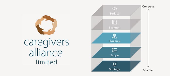
The Strategy Plane
Starting from the Strategy plane, to proceed to find out what I want the product to accomplish for the organisation. And also what I want it to accomplish for the users.
Business Goals

The primary business goals assumed for CAL are:
- To reach out to all caregivers of persons with mental health issues in Singapore and empower them to achieve a high level of well-being and resilience.
- To meet the needs of families and caregivers of persons with mental health issues through education, support networks, crisis support, tailored services and self-care enablement.

The above Business Model Canvas I’ve created for CAL using hypothesis. Using the BMC helped me identify how this organisation works on a whole picture from:
- Who CALs serves Customer Segments?
- Caregivers of loved ones with mental health condition in Singapore
- Caregivers of friends with mental health conditions
- Hospital
- Schools
- Corporate Companies
- Communities Centres
- Faith Based Groups - Value Propositions This organisation wants to solve for their user etc. problems and satisfy user needs.
- Providing education, support networks for Caregivers.
- Providing crisis support, tailored services and self-care enablements to Caregivers.
- Outreach to different communities to spread awareness about caregivers
- Help caregivers understand how to care for their loved ones and themselves.
- Providing a safe and caring community for caregivers
- Empowering the hidden heroes - What are the Channels they delivered to users through communication, distribution?
- Websites
- Telegram and Whatsapp
- Facebook, Instagram, Twitter and Linkedin
- Fundraising Events
- Newsletter
- Posters and Banners - Using which platform to maintain Customer Relationship?
- Whatsapp support group for Caregivers
- Social Media Communities
- Newsletter
- C4C support group for caregivers who attended C2C
- Telegram channel for the public - Where CAL can get the Revenue Streams from?
- Government Fundings
- Donations from corporate organisation
- Donations from the public
- Fundraising Events - Who are their Key Resources?
- Programme Trainers
- Corporate staff
- Donations
- Volunteers
- Part-timers - What are the Key Activities that CAL deliver previously?
- Caregivers training programmes
- Individual Training and support
- Workshops to raise awareness for caregivers
- Trauma Informed Care Workshops
- C4C support group for caregivers - Key Partner what are some of the outsourced and resources acquired outside the organisation.
- Hospitals
- Community Centres
- Corporate Companies
- Faith Based Groups
- Schools
- SSAs & Foundations
- Volunteers
- Donors - Also to find out what is the Cost Structure that organisation uses
- Maintenance of main office
- Cost to train trainers
- Cost to run training programmes
- Staff salaries
- Rental of training venues
Product Objective
CAL needs a website to support and meet the needs of Families and Caregivers, the challenge is to explore how they can use their website to reach out to more caregivers as this is the also the organisation’s Value. The website needs to also have the relevant materials to support families and caregivers of persons.
The Lean UX Process
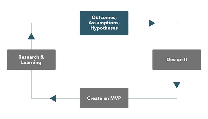
Using the Lean UX approach starting the process with assumptions and outcome to create and test our hypothesises. This is to reduce the risk of going too far towards the wrong direction. During this decision making process to sent out 6–7 online survey questions to users, in a short time frame the response rates was great.
Online survey was done with:
• Caregivers
• Volunteers
• Age range: 30–55
Business Assumptions
Some of the business assumption includes:

User Needs
Taking a look at the user needs for CAL, below is the Proto-Persona that I’ve created to define by her goals. Using assumption through Lean UX Approach, this Proto-Persona is the target audience where CAL wanted to target on. I’ve also included her daily tasks on how she is coping with her life, from here I now understand more on how CAL can help her achieved her Goals.

Validating Assumptions
Making sure the proto-persona that we’ve created is correct, I’ve draft and sent out a google doc survey form and managed to gather 15 well received responses within 2 days. Using this quick and easy method to gain some insight into my users within a short period of time.
These are the questions in the survey:
- How do you decide which organisation to go to for support?
- Where do you find the support resources you need from a particular organisation?
- What influence you the most before you decide to reach out to CAL?
- What information you usually look for in the CAL website?
- What do you consider to be the most helpful information from CAL website?
- Are there any new features that you wish to see on CAL website? If yes, please tell us more.
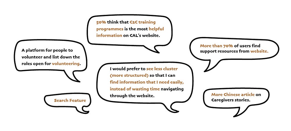
From the above findings, redefining our proto-persona on her Goals and her thought also adding in the “Opportunities” area, where to help her achieved her goals.

The Scope Plane
Strategy become Scope when translating the product objectives and the user needs into specific requirements for what functionality and content the product will offer.
Next going into:
“Why are we making this product” to “What are we going to make?”
Feature Hypothesis Statement
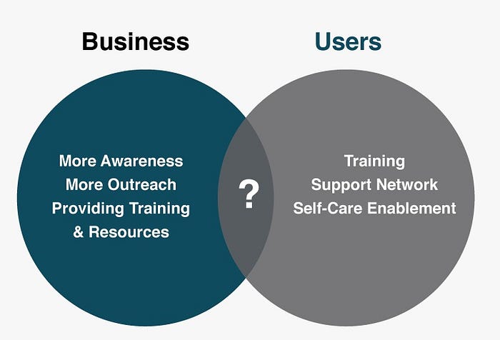
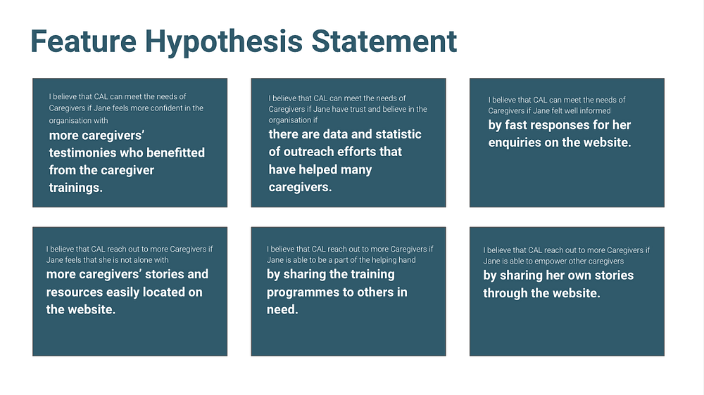
Forming an understanding of the business goals and user needs. Next to form hypothesis on what is the features to have. Some examples include:
User Stories
Using the Agile methods to translated our hypothesis, then using the MoSCoW framework then breaking down priorities of our User Stories.

Content Inventory and Content Audit
Listed down every content on the CAL website on each page, including the main page and sections of each page. Then proceed with content auditing, where to Examine and Assess the quality of each content listed in the inventory and then deciding which content to Keep, Modify or Remove.

Content Framing
Here is an example of the content framing for CAL’s homepage.
From the Most Important, that is the “Caregivers Training Programmes” it is the most voted content that user wants to see. To the Least Important, which is CAL Address and Helplines content.

The Structure Plane
Going into determining what the users wants to experience after the content requirement has been set.
Information Architecture
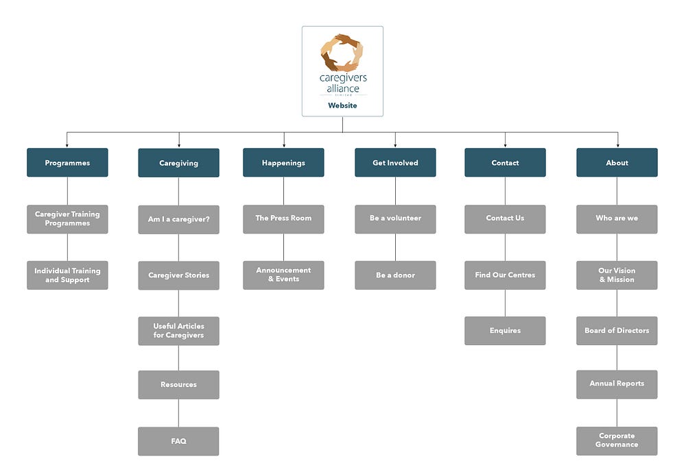
Using card sorting method we did the Open card sorting methods with 3 users to know how our they think about information at the Most Highest Level, and to know what are the different categories they will want to have or behave. With those results we got from Open card sorting methods, we have included some of the categories for our Closed card sorting methods, with that we have result concluded some of the Must Have Categories to be changed or arrangement, below are some of the examples:
- Changing the naming convention from “Services & Support” to “Programme”
- Placed “Programme” as the first tab as a large number of caregivers come to our website for the programme registration
- Changing the naming convention from “Resources” to “Caregiving”
- “Caregiving” are the 2nd Most Important, this will improve the discoverability
New Proposed Information Architecture
Interaction Design
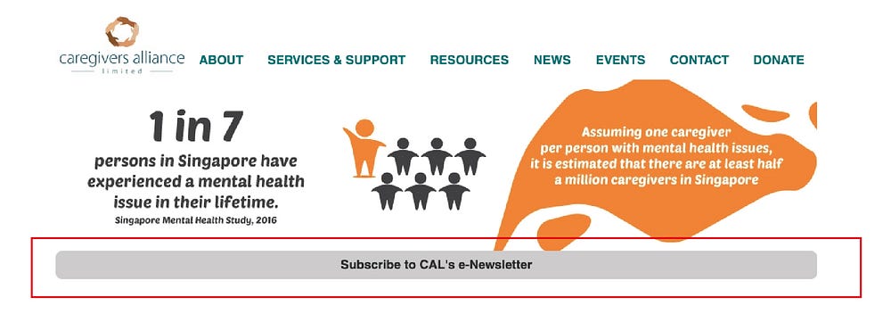
An audit was done based on the 5 dimensions of interaction design it is to highlight the areas we should take note and improve the usability, making sure how users use the product.
Visual Representation
Designs should be consistent in appearance and behaviour, so users are able to focus on their initial objectives of visiting the website and not be drift away or distracted by unexpected changes or usage of the website.

Words
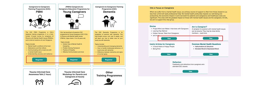
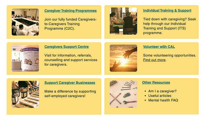
The lack of CTA buttons e.g. Click to view, for these trainings may mislead users that it is just an informative page. And a number of unrelated content are placed at this service & Support page which create a cluttering of information.
Behavior
There are two tabs that both announce the updates for CAL. It may confuse the users who are looking for latest updates for the organisation whether it is news, announcement or events. All announcements could be combine as one so users do not have to visit two pages to look for updates.
Solutions
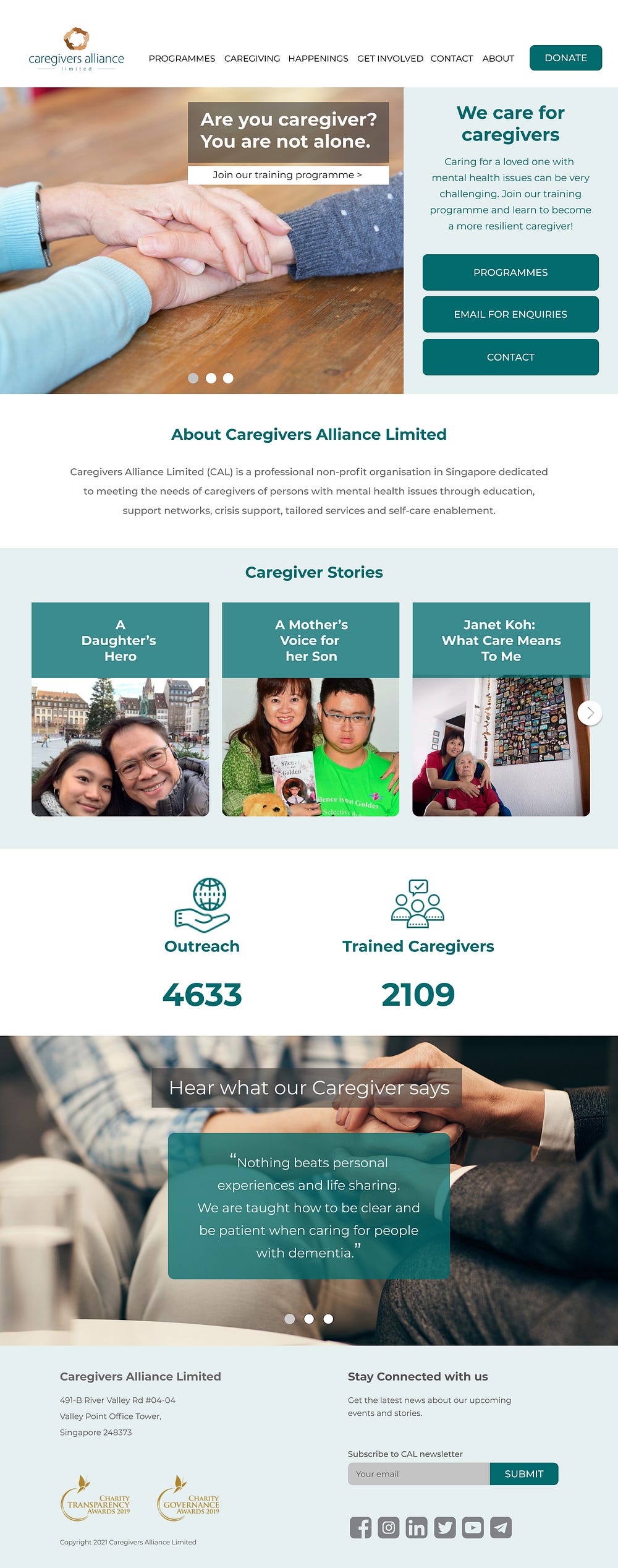
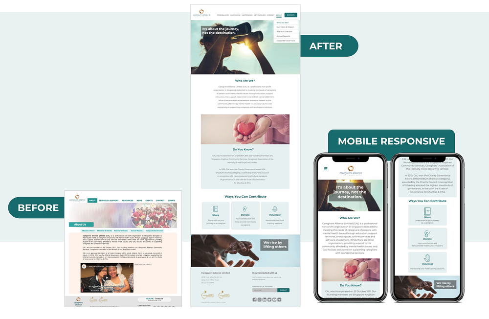
(HomePage) Providing help and support at one glance.
- Hero banner includes ONE click access to helplines and support
- Leading users to feel empower
- Hierarchy of content show the most important to the least important.
(Programmes) A clearer view on the list of trainings provided by CAL.
- The website objective is to outreach to more caregivers to check out the programmes.
- Only the training titles are displayed on each section to not overwhelm caregivers.

(Registration) A seamless user experience when doing the training registration.
- Form design blend in with the programme page.
- A consistent interface design for the form will prevent confusion when lead to a 3rd party website.

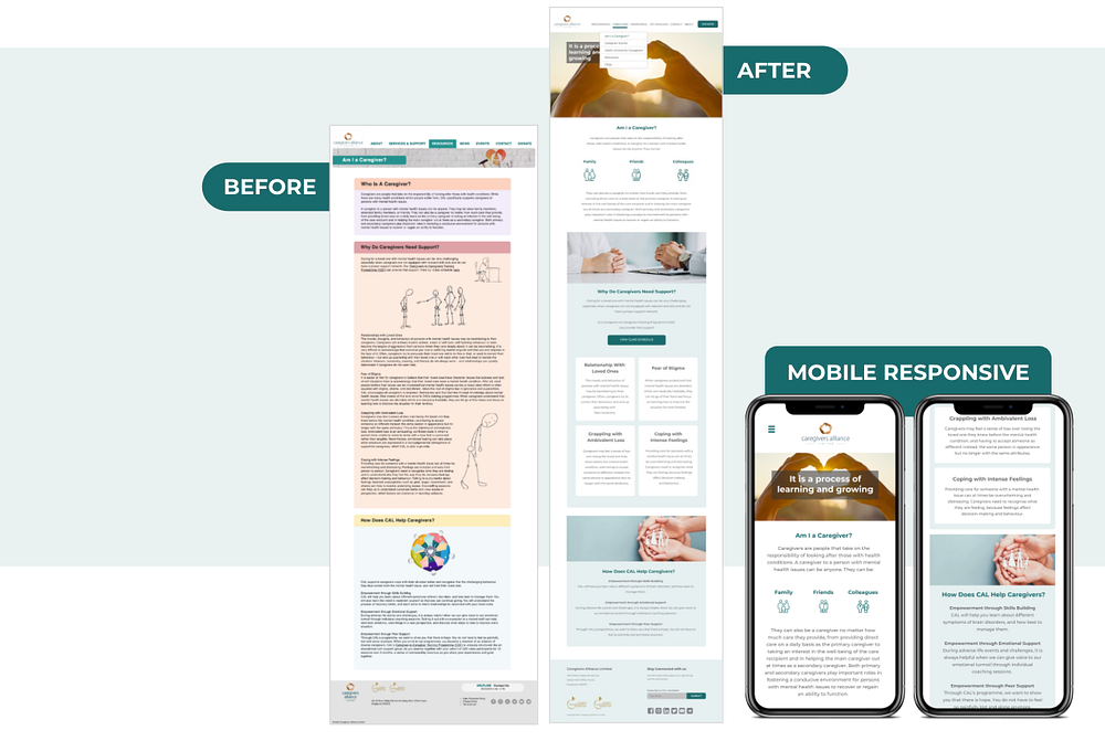
(Caregiving) Providing comprehensive resources in bitesize content
- Prominent imagery on the hero banner with empowering quote
- Adding icons for better understanding
- Edited the content writing for better readability

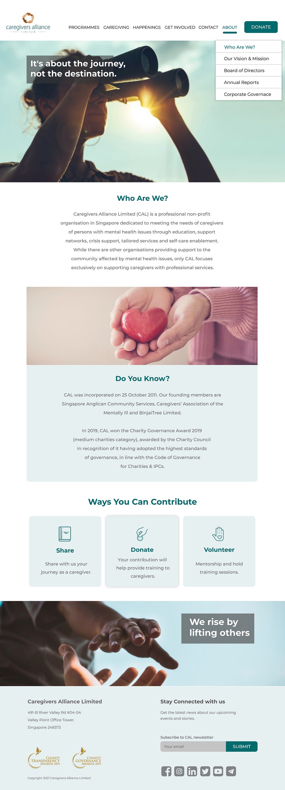
(Who Are We?) Providing a clearer understanding on who is Caregivers Alliance Limited.
- Presenting the history of the organisation as a fun fact content motivate caregiver to read more about CAL.
- Interactive buttons are added to also promote ways that the public and caregivers can contribute back to CAL.
Interface Design

Standardising look of the buttons for all the pages
“Donate” button is added to encourage donation as a non profit organisation, funding from donation is still important to ensure the organisation smooth operation.

Minimizing visual clutter by creating a consistent icon representation.
Using the 12 columns grid for website and 4 columns grid for mobile to create a more uniform and neater style for the website.

Form registration element is emphasize with a slight drop shadow and the overall design is simplified to blend in seamlessly with the website.

Creating a well balance look for imagery, graphic and text on the page
promote easier reading experience.
Added drop shadow to hover effect for call to action buttons on the “Who are We” page.
Subscription to the newsletter is also added at the footer for more people who wish to stay connected.
Navigation Design
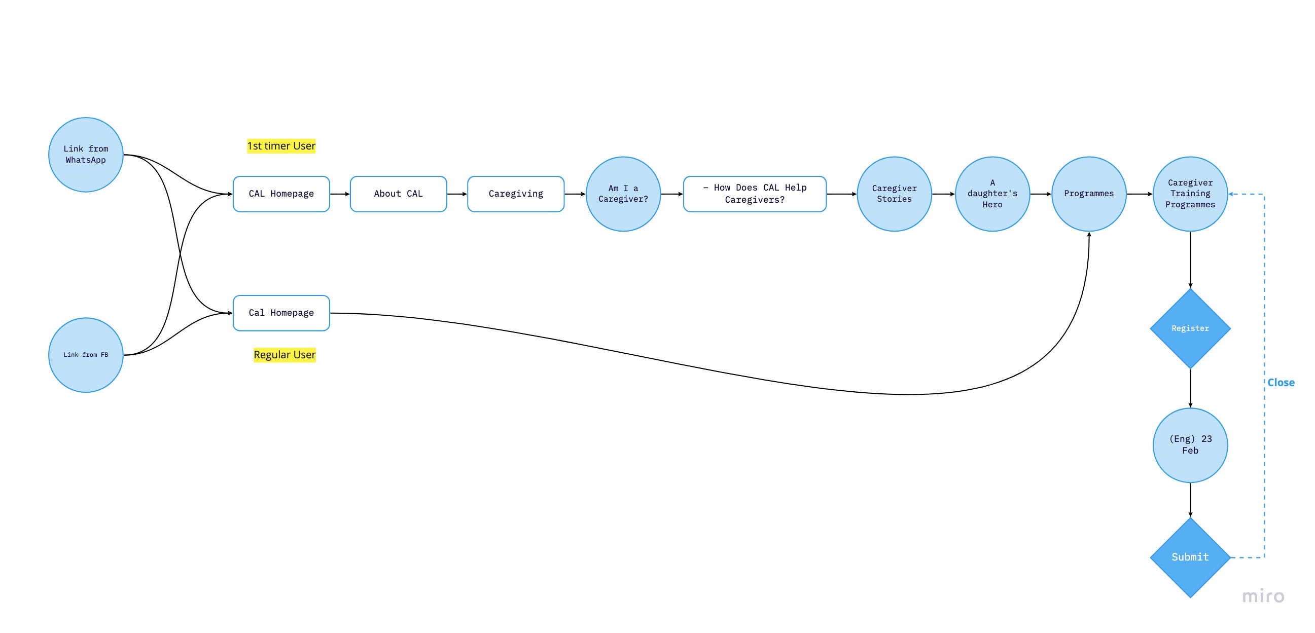
Multiple entries points:
- From Whatsapp OR Facebook (Social Media)
- New User OR Regular User (Organic Traffic)
User will look into the organisation information and resources before deciding to engage for their support and training.
Information Design
Content writing
For the web content, we go by the theme of empowering, caring, and empathy. To ensure that the content is short and sweet, we redefine and shorten the content writing to avoid information overloading our users. When the message is too long, the main objective of the content may be lost.
Empowering short quotes were added in the hero banners to empower and motivate caregivers who may be feeling stress when visiting the website for help and support.

Consistent Icon Styling
It is important to stick to a specific and cohesive theme for our icon design in order to convey a visual message clearly and quickly.

Data Visualisation
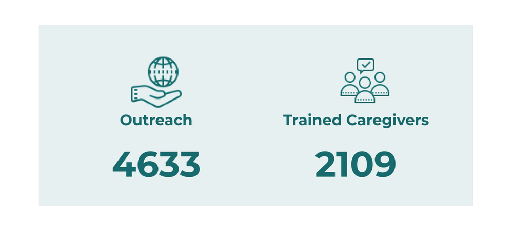
Displaying statistic data that CAL has reach out to and the number of caregivers that CAL has trained on the homepage.
Hero Images
Imagery used are more personalised and heartwarming images that symbolises that CAL is there to offer a helping hand to all caregivers.

Sensory Design
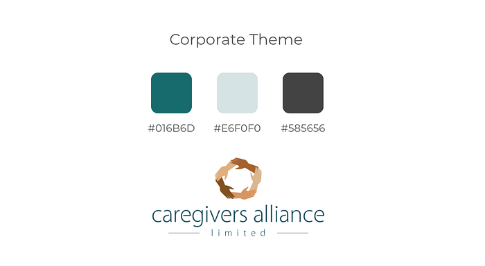
The overall colors used are part of the corporate colours from CAL logo.
Uses green and light green from the logo text for website to create a calming and soothing yet empowering brand personality for the website.
Mobile Responsive
- Based on research nearly half of the audience uses mobile device to surf the CAL website.
- It is important to maintain a consistent browsing experience for web and mobile.

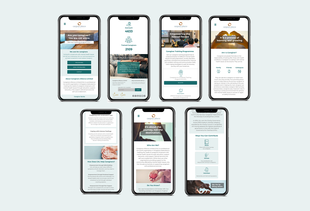
View our Marvel Prototype here: https://marvelapp.com/prototype/g0dhicb